BRAND

Project
Summary
Made With
Redefining the way
soldiers train
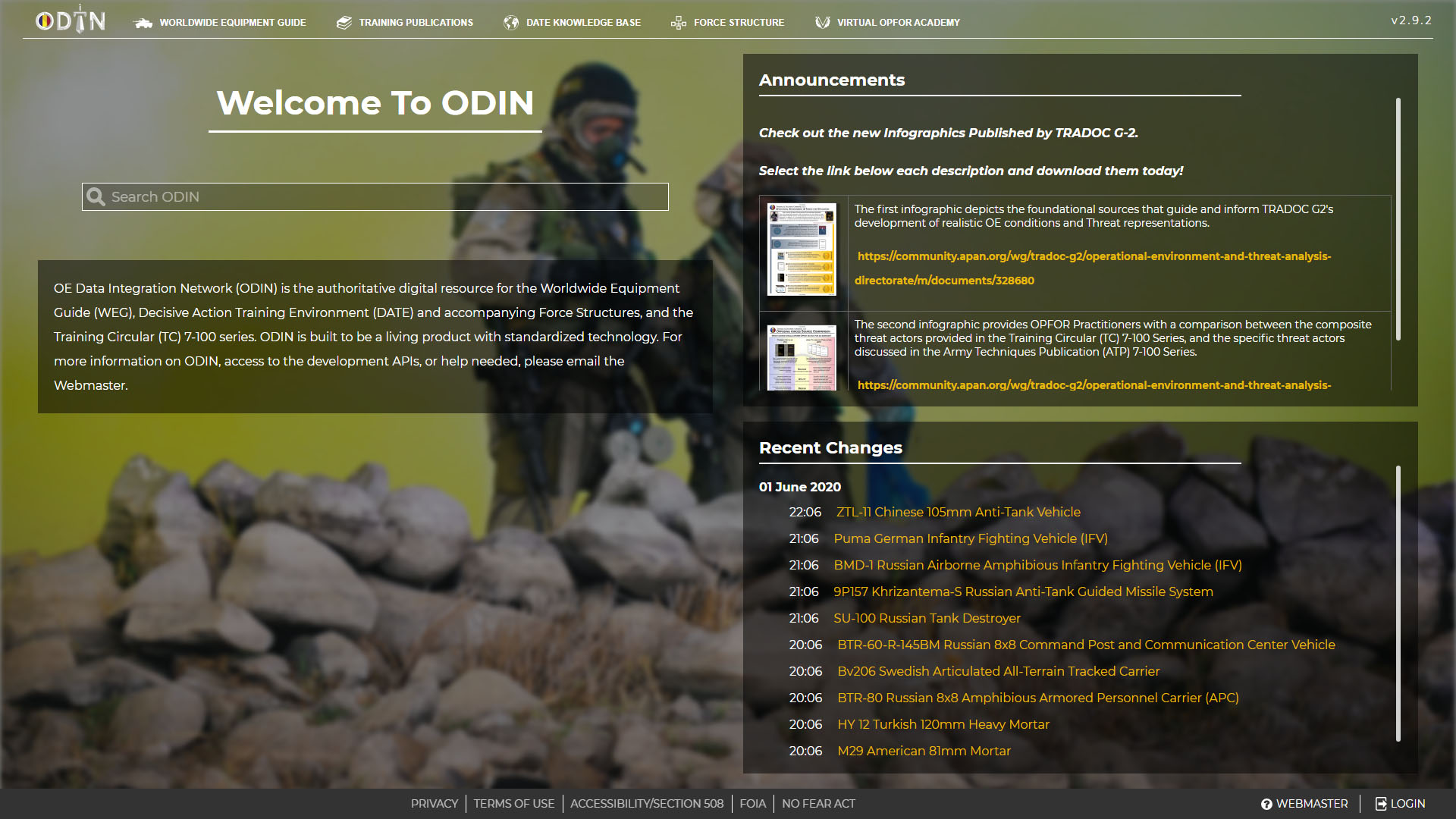
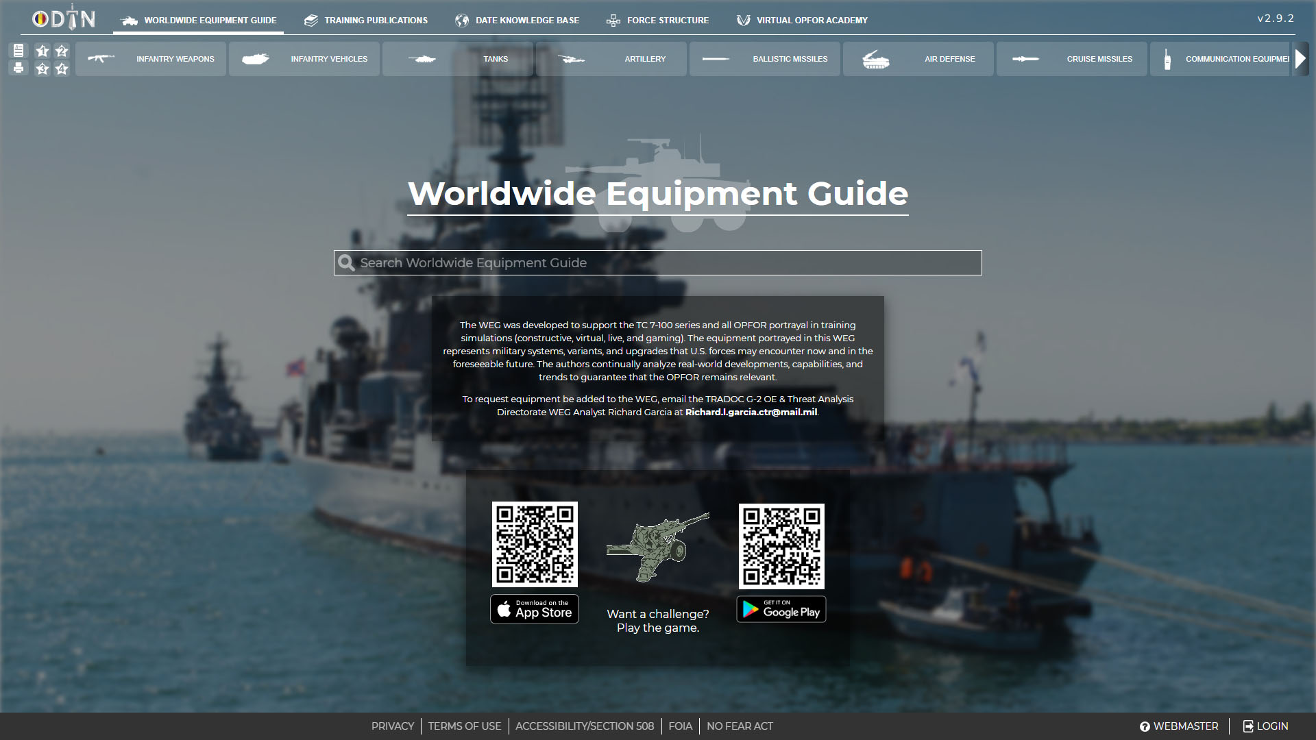
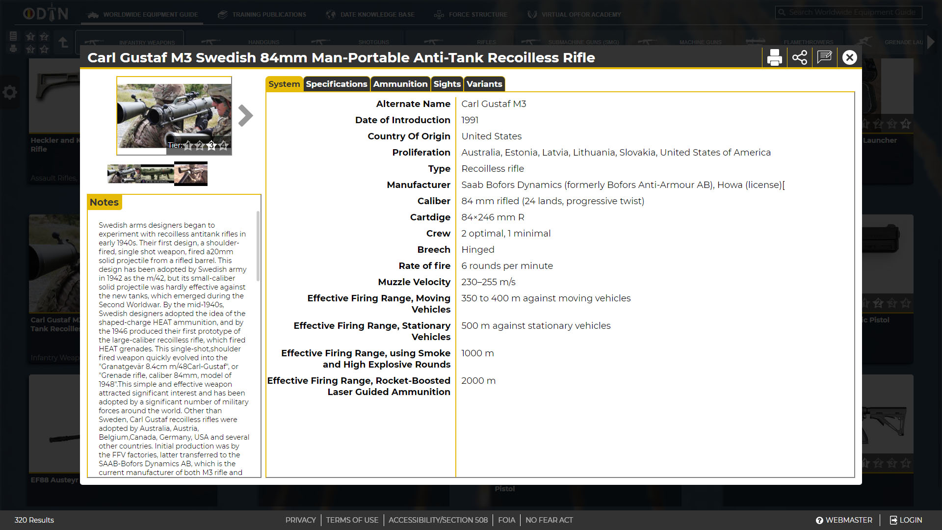
A U.S. Army project, ODIN is a web application that
serves the exercise planning and training community. ODIN was released in 2018 and is a daily used resource for soldiers.
Chris Hassebrook
Daniel Wilson
Duncan Iaria
Eric Monachello
Jacob Berry
Rachael Spayde
Jennifer Truss
David Byers
Mark Mahn
Cassandra Trissler
Zach Helm
Background
the challenge of redefining doctrine
In 2016 the U.S. Army Training and Doctrine Command (TRADOC) G-2 Intelligence tasked my team at IDSI to research and protoype a new way for soldiers to store and access written content. They identified a gap where all content was being created in a word processor and stored in word or pdf files on sharepoint for users to donwload. The process of storing and sharing data wasn't dynamic and users found it cumbersome to navigate and difficult to find key information.
UX Research
Understanding the USER
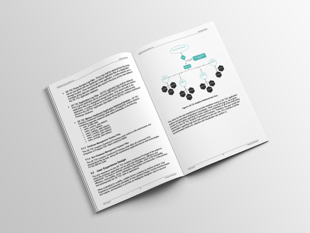
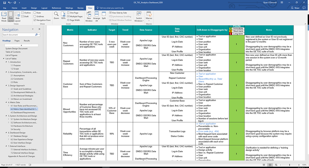
Before we could discuss features, we had to understand the problem. The customer provided over 1000 pages of content to review, which I worked with the design team to break down and understand. We quickly identified two customers for the product, authors of the content and end users. After several months of research, we began "How Might We's" and mapped concepts to start brainstorming with the customer.
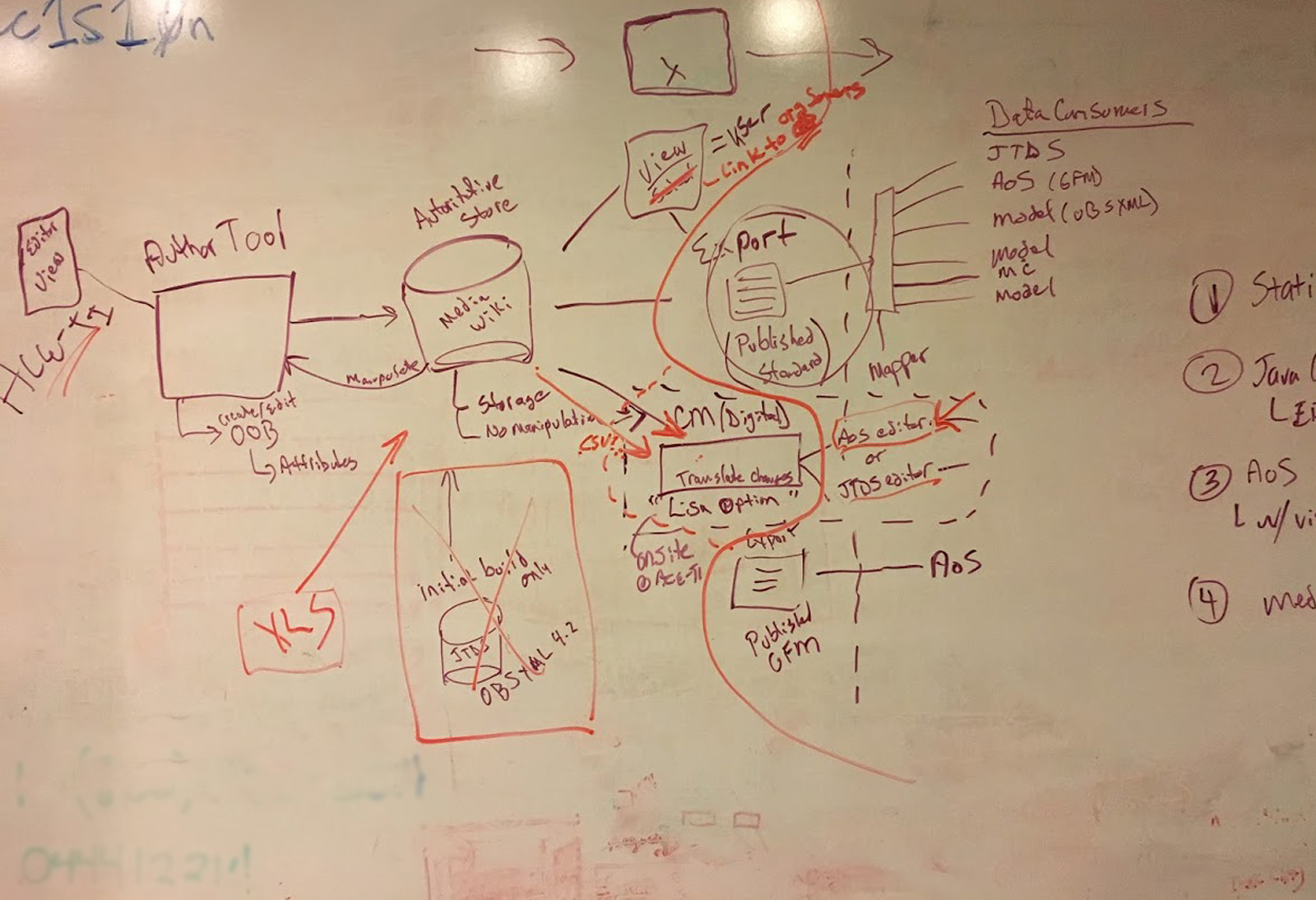
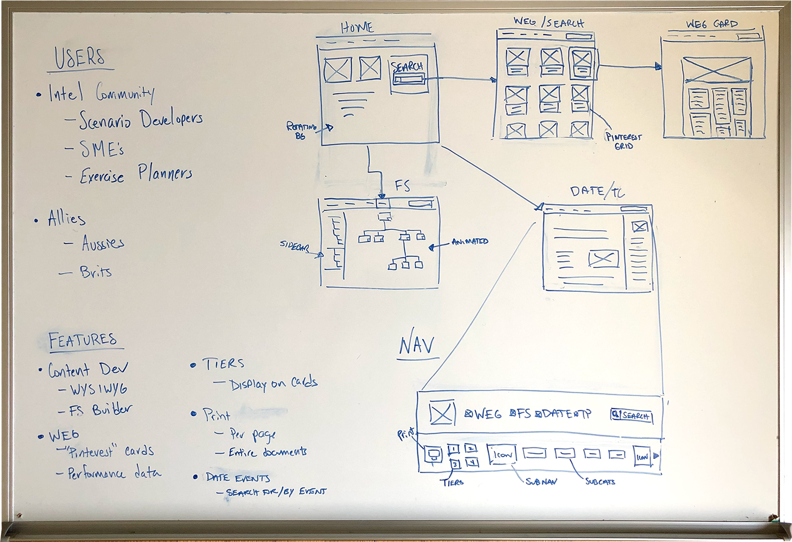
Now that we understood the problem I flew out to Leavenworth, Kansas to began initial brainstorm sessions with the content authors. We had some sessions on what their overal vision for process management and who the users of the product could be. As we started to refine ideas, I began sketching design concepts. As they started to see the product come together
Defining the Product
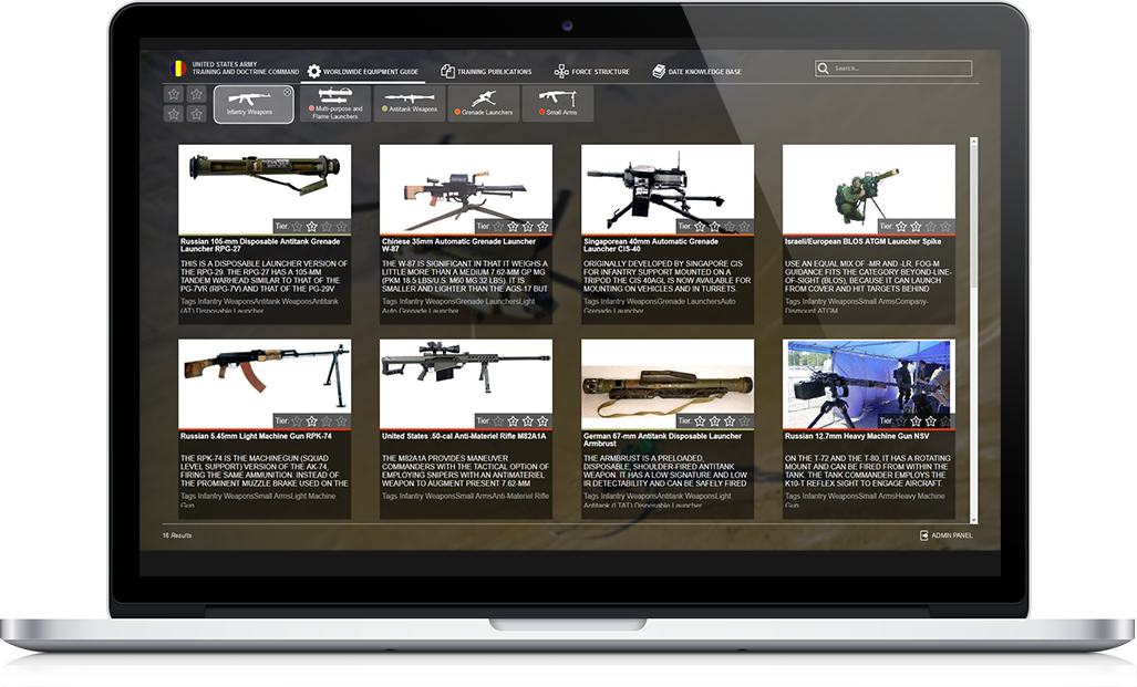
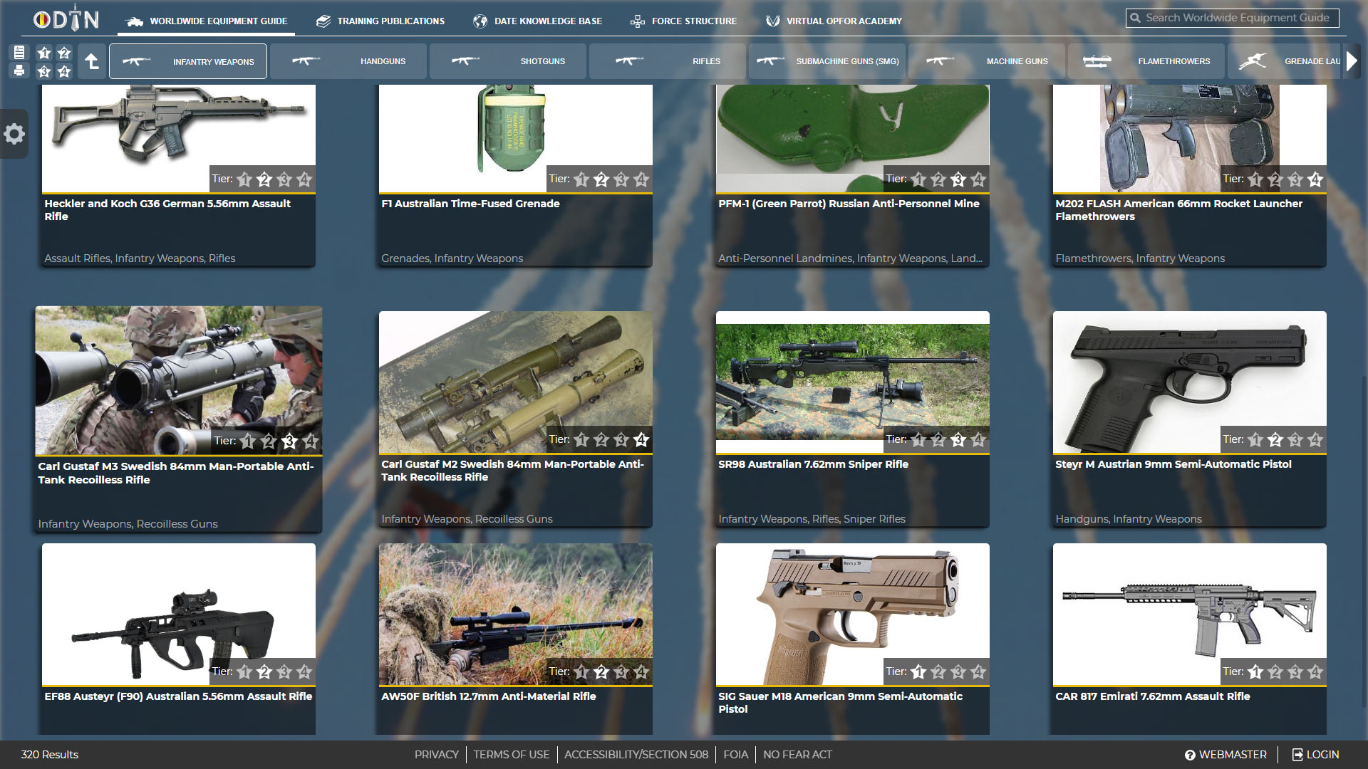
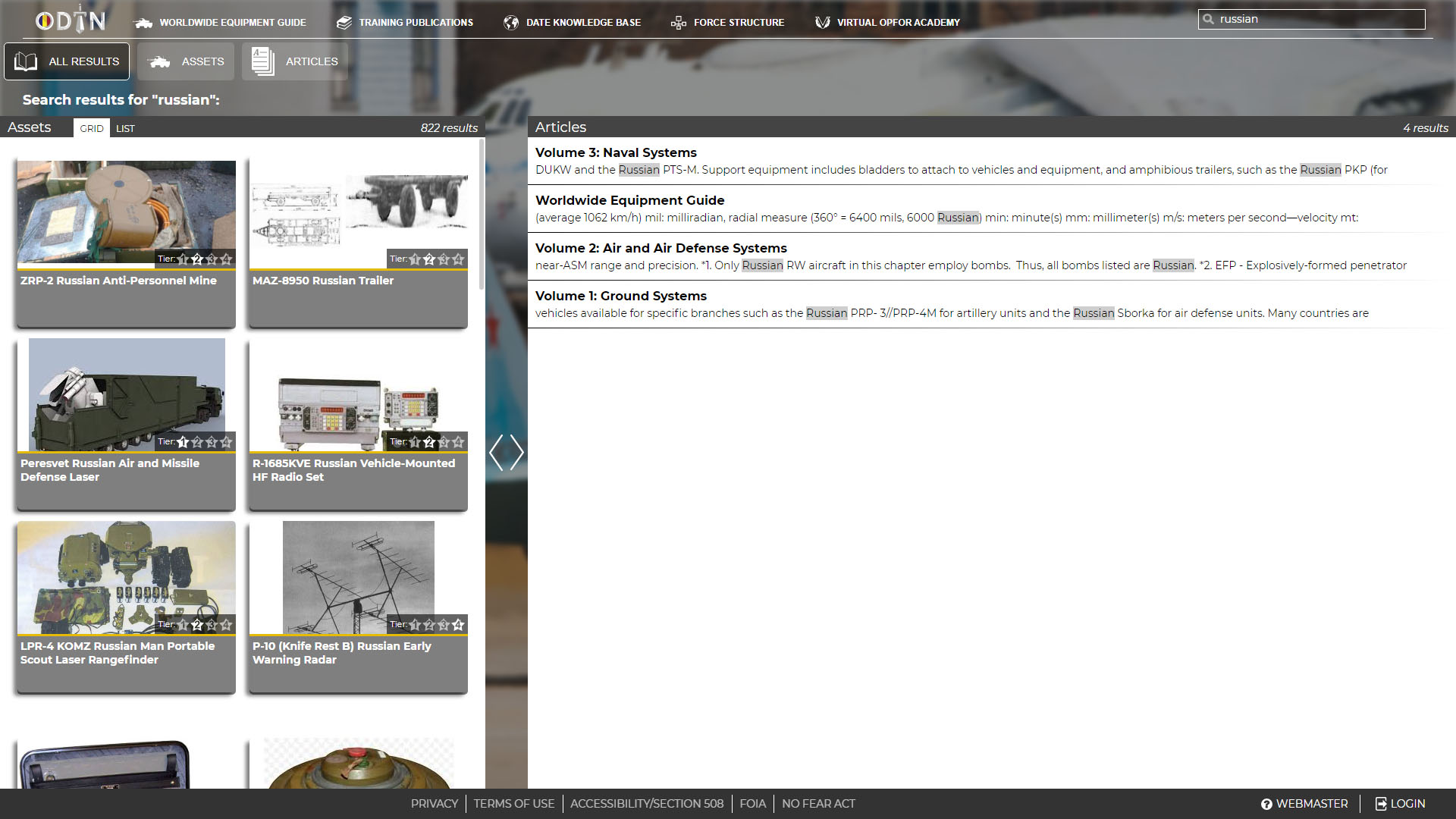
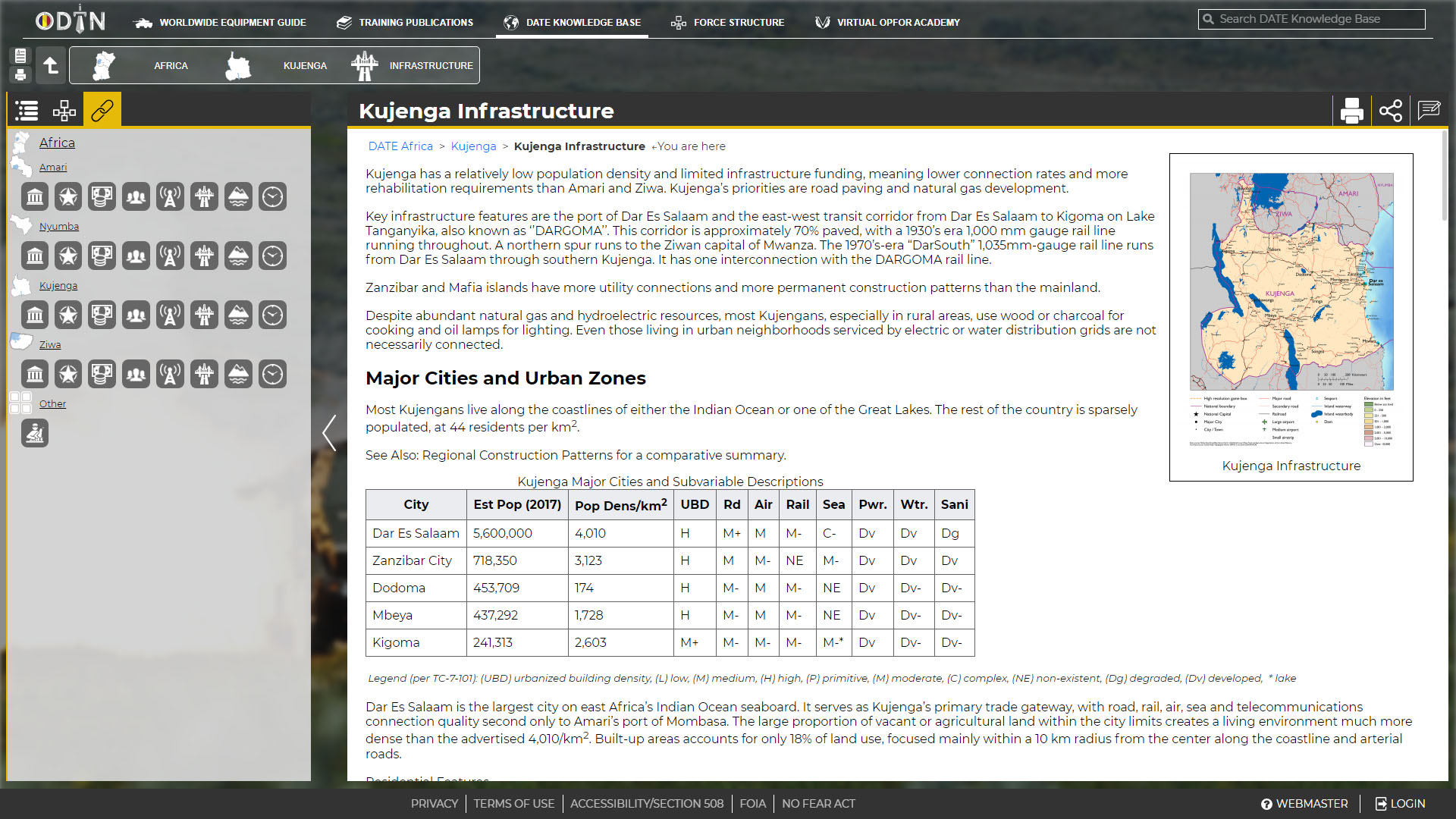
Coming away from the initial sessions, we knew we had two main problems to solve. We needed a way to develop content and an intuitive way to display that content for users. Working with my design team, we worked up designs that I knew would resonate with the customer. I wanted key focus areas to be easy navigation, an intuitive search interface and smart display of information.
After technical discussions with the development team, I recommended we go with the Mediawiki framework. I suggested this to help keep us in scope and use Mediawiki's templates to achieve key functionality. After working through some initial designs, I worked with the development team to prototype a solution.
MVP Delivery
BUILDING A prototype
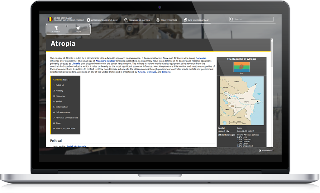
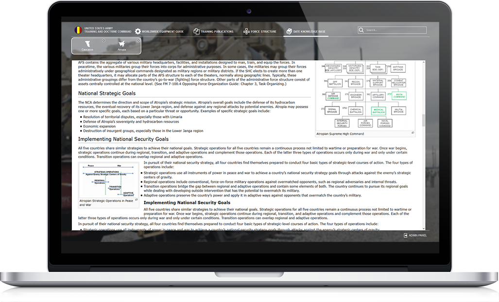
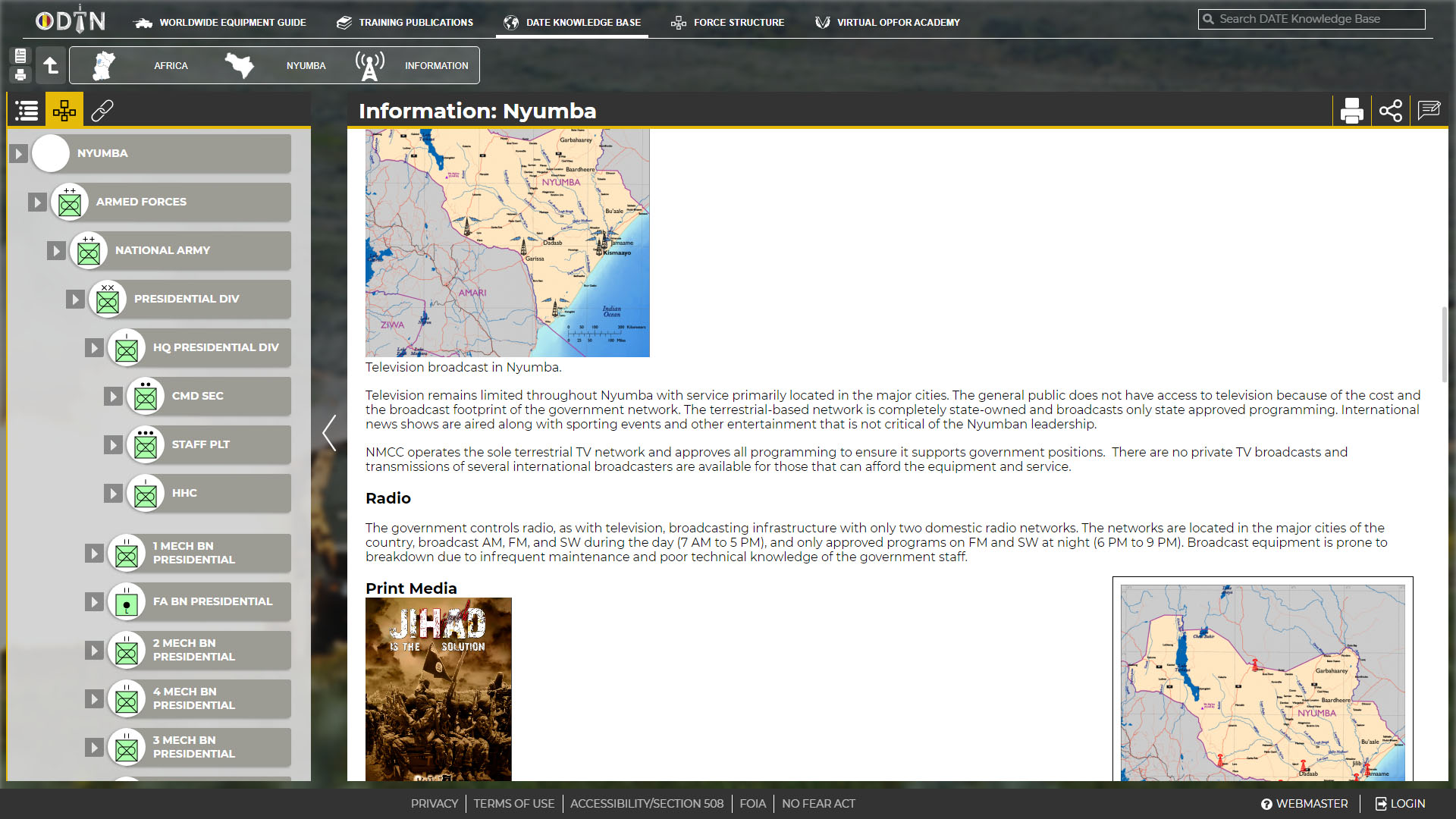
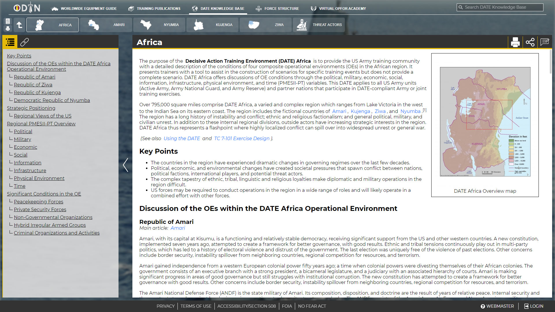
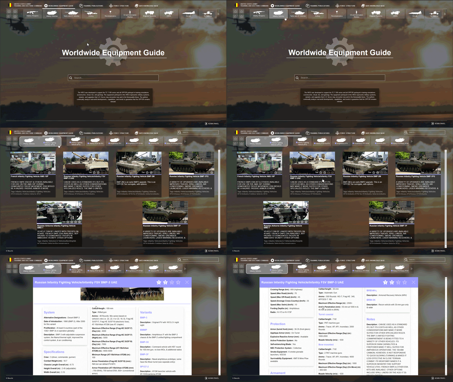
Coordinating development of the prototype, we setup a Mediawiki instance and developed a custom front-end as a single-page app so users can navigate easily between content.
I worked with instructional designers to reconstruct previously developed content for a dynamic, web-based format. Additionally, we reached out to the modeling and simulations community to begin connecting data and demonstrated the prototype to the customer.
Development
Scale & Deploy
Once users and authors got hands-on with the project, change requests started rolling in. I worked with project managers and stakeholders to help prioritize requests, with the team to rapidly prototype new features and their impact on user experience, and with content authors to help build better business practices for developing content.
We deployed ODIN v.1 to the U.S. Army Azure Cloud, the first app to be deployed on the service, in the summer of 2017. Once deployed, we decided to refactor the front-end to better align with feature requests coming in.
Feedback
Refactoring and user metrics
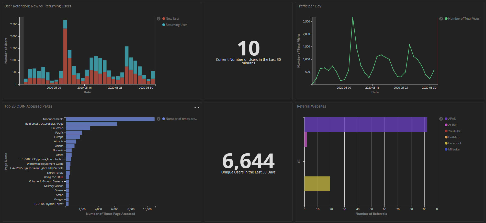
While refactoring both the design and frameworks, I worked with the customer and our data science team to identify metrics that could provide insights to greatly improve the product. The team identified over 20 metrics we could capture and I managed a small group of developers to research building dynamic data visualizations using elasticsearch, logstash, and kibana, known as the ELK stack.
This was a huge success and value add to our customers. We were able to build flags directly into the code to capture any user behavior and usage data. After building this functionality, we were able to target areas to improve ODIN, going from an average of 2,000 monthly users to over 6,000.
Iterate
Additional development
As ODIN's success has grown, several of the initial features have expanded into their own applications.
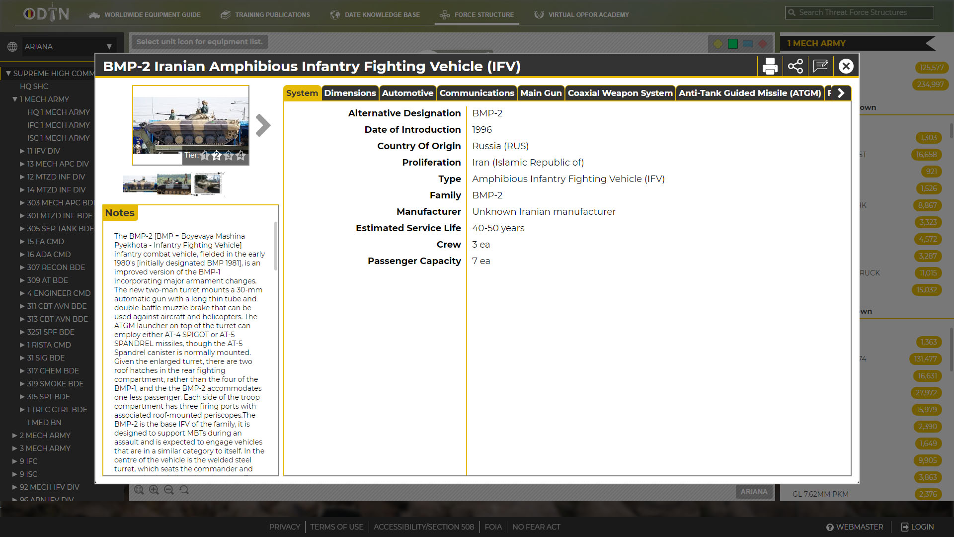
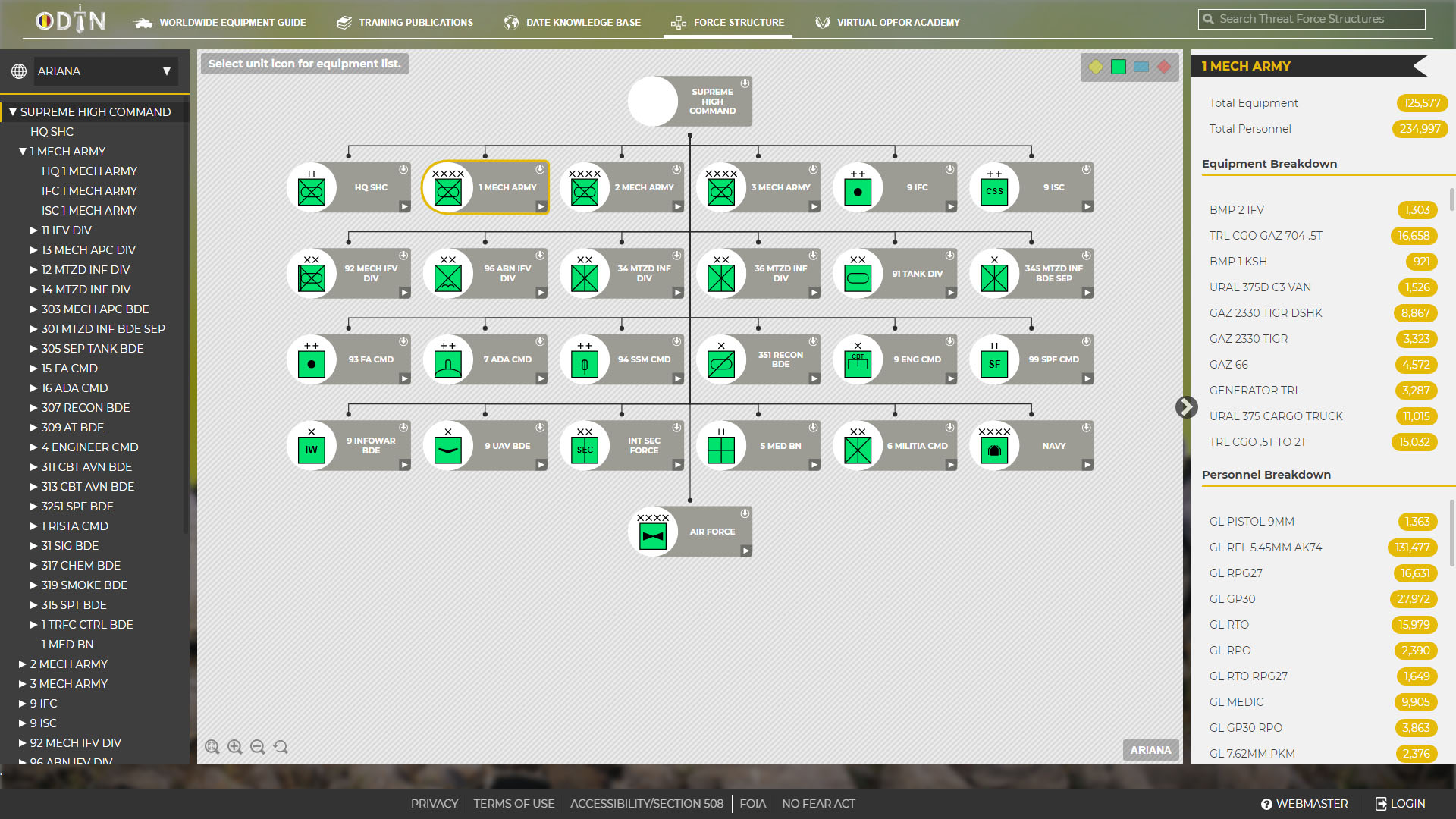
The force structure authoring tool, which gives authors an intuitive UI to manipulate data, is one of the most significant features added to ODIN. Previously, manipulating this data was cumbersome and required extensive knowledge in task organization by the military. I worked with the design team to create an intuitive user interface that would give users nuance control of every data element.
The desktop offline ODIN is a downloadable version of ODIN that users can use while working in an area with limited internet connectivity. This was a huge feature for the national training schools, because they are able to use ODIN on-the-go, updating the content as needed. Once the desktop offline version is connected to the internet, users can sync data with ODIN.
